How to Design Your eCommerce Store By Looking at Shopify Product Pages

Since Shopify launched in 2004, the ecommerce platform has managed to amass half a million active online businesses, and has generated more than $40 billion in sales around the world. It’s one of the most popular options for business owners who want to launch an online store but don’t have endless resources to build something from scratch. Thanks to its longevity in the market, a lot of entrepreneurs have had time to explore the platform and build successful, experienced businesses that others just starting out in the market can learn from. Take a look at some of the things you can learn about ecommerce store design, just by looking at Shopify product pages:
- Taylor Stitch
- SkinnyMe Tea
- Beardbrand
- Haus
- How to design your store
Taylor Stitch

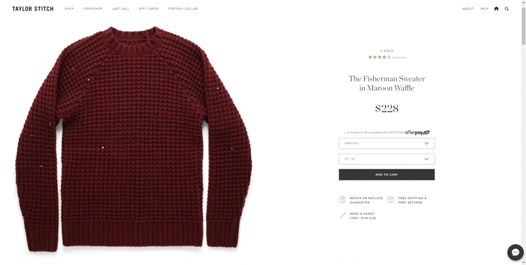
Taylor Stitch launched its online store with Shopify in 2010. A mere three years later, they earned $1.5 million in revenue and have continued to grow since. The business specializes in creating custom, high-quality, and tailored menswear. The product pages on their website are overall professional and polished, putting strong emphasis on the products they sell. On first glance, the first thing a customer notices is a clean, crystal-clear photo of the product in question on a bright white background. These photos then transition into situational images. Other elements included on the page include apt product titles, easily accessible policy information (such as repair and return policies), and well-detailed product descriptions. All of these elements come together to acquaint potential customers with the goods on offer and to make them feel comfortable buying without being able to see the item in person first. Two elements that make Taylor Stitch’s Shopify product pages stand out are their use of reviews, and an ever-present chat button to connect browsers to customer service at a moment’s notice. These elements serve to create more faith in the brand and are likely to convert to higher sales down the line. The brand’s website is also mobile-friendly, which will allow for sales on a variety of platforms.
SkinnyMe Tea

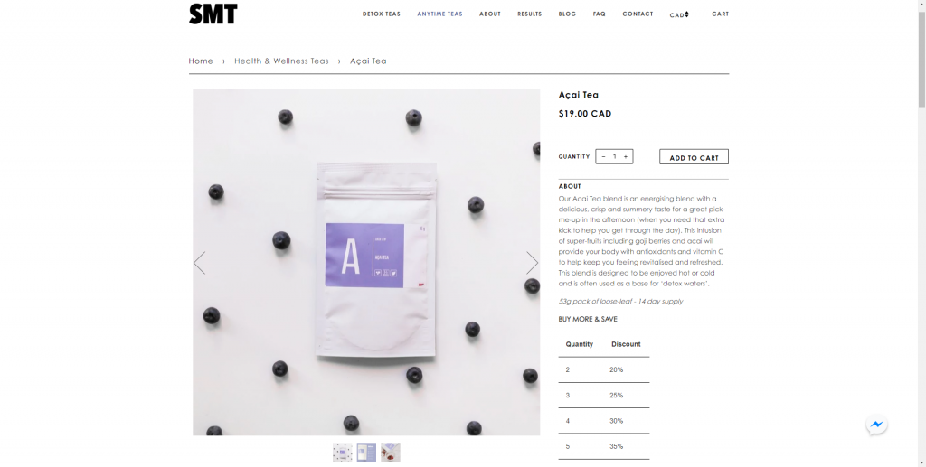
In 2012, the Australian company SkinnyMe Tea launched its ecommerce store with the goal of selling the world’s first “teatox,” which aims to help people “detox” with tea. According to their About page, the wellness company has since helped more than 350,000 people reach their health goals. As is common with Shopify product pages, the pages on SkinnyMe Tea’s website rely heavily on displaying their product through the use of images. The company also includes reviews, a “related products” section, and a chat bubble to connect consumers with customer service. However, their best use of the pages is through the descriptions they write. Unlike with clothes, purses, and most other products, tea is more about the taste than the look, which is a sensation that can’t be conveyed through imagery alone. SkinnyMe Tea compensates well for this issue but writing adjective-filled descriptions that help evoke the imaginations of potential customers, gently nudging them into making a purchase.
Shopify Product Pages With Beardbrand

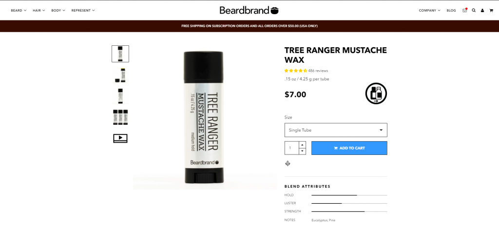
When entrepreneur Eric Bandholz found himself working for a company with a “no facial hair” policy, it inspired him to leave the company and launch his own facial hair care business. Beardbrand came to life in 2012, and has since grown in popularity. The brand’s accompanying YouTube channel has more than one million subscribers. Beardbrand’s product pages start out similar to other brands. They use clean photos on a white background to highlight the product, offer reviews and a quick customer chat bubble, and their product descriptions are highly detailed. The online store also uses banners at the top of the page to make customers aware of special sales and deals. Perhaps the best thing about Beardbrand’s ecommerce store, however, is that they leverage their skill with video production to add an explanatory video to each product page. This gives customers a secondary way to consume information about a product, allows them to see it visually through a different medium and may be the last push they need to make a purchase.
Haus

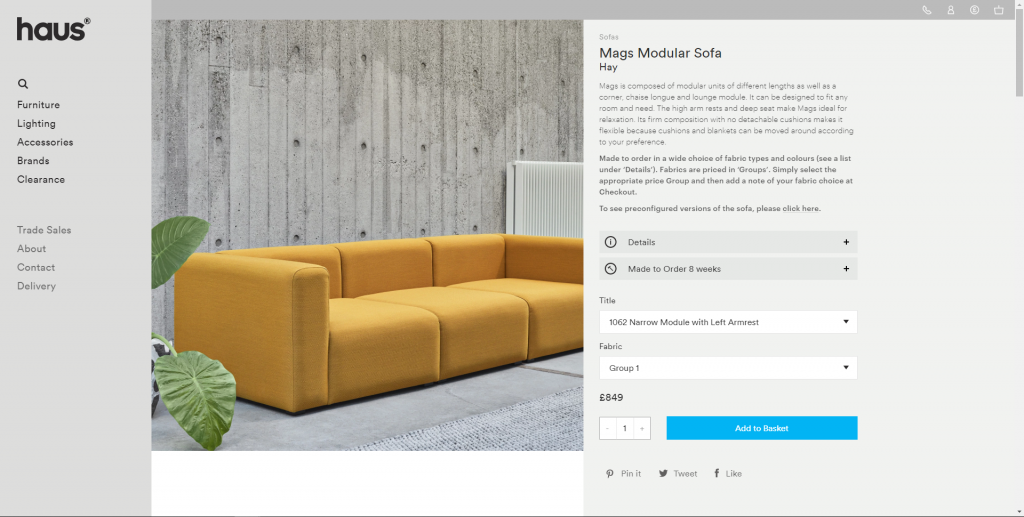
Haus was established in London, England in 2007. They are a modern company that sells sleek, modern furniture. The design of their ecommerce store reflects that of their products. In addition to being photo-centric, well-described, and easy to navigate, Haus has also mastered the colour palette of their website. They chose a very minimalist, neutral-toned design to make the simplicity and colour of their furniture pop. Unlike other online stores, the brand has also chosen not to use a customer service chat button or reviews on product pages.
How to Design Your Product Pages

If you talk to a dozen different web designers, they’re going to give you a dozen different pieces of advice while swearing that the advice from everyone else is wrong. That doesn’t mean you shouldn’t talk to web designers, who are experts in their craft and can help put you on the path to creating a beautiful ecommerce store that will embody the heart and soul of your business. However, in addition to consulting designers, you should also take a look at the product pages of some of the most popular online stores in the market today (especially the ones in the same industry as you). As discovered above, many of the elements will be consistent across the board. For example, most product pages focus first on photos, before getting into written descriptions. This is for a very good reason: photos are attention-grabbing. Ask yourself what those stores are doing well and not well, what they all have in common, and what they are missing (so your store can fill the gaps). Your product pages can be designed one hundred different ways, but every way will be successful if you take the time to research the industry and the elements that make it successful.
Visit Shopivo and stay tuned for exciting news and updates! Sign up for our emails and stay up-to-date on new developments and features.
