The Ultimate Design Checklist for Your eCommerce Website Development

So you’re starting out in the world of ecommerce. You have a website address, you have a product, and now you need to start designing what your website will look like. But with so many different options, it can be tricky to know what will work best for your website and for your sales.
To help you out, we’ve put together this handy checklist to guide you through your ecommerce website development. It will help you decide what to put on your:
- Home Page
- Product Page(s)
- Checkout Page
- Contact Page
- Optional Pages
Home Page
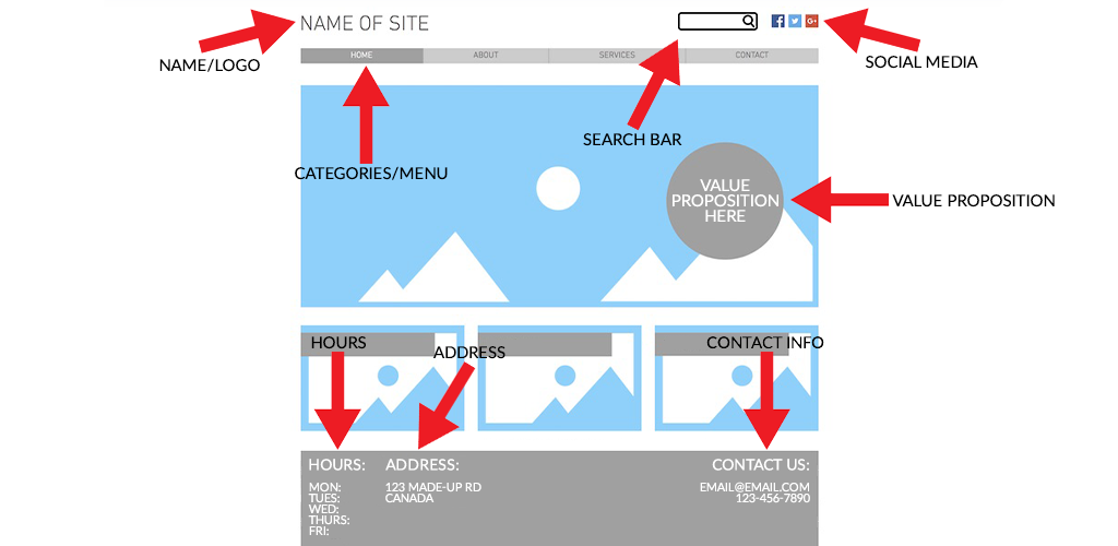
- Name and Logo: Start with your business’ name and logo. This way customers know exactly who they’re shopping with.
- Categories/Menu: In a banner at the top of your home page, it’s usually best to add navigation buttons for the different categories of products you sell. For example, a clothing boutique might have categories that say “dresses,” “pants,” and “sweaters.” A baking company could have categories labelled “cakes,” “cookies,” “breads and pastries.” This will help your customers find what they’re looking for with ease. Use menus to help customers navigate to non-product pages too, like contact information, blog posts, and more.
- Search Bar: In the event that your customer knows exactly what they want and don’t want to scroll through pages and pages of products, allow them to narrow down the search even further with a search bar.
- Competitive Advantages: What’s your advantage over other businesses? Figure out what it is and tell your customers just that with a few catchy words on the front page. For example, a bakery might use the phrase, “fresher, healthier, yummier,” on the homepage to tell customers exactly what they should expect from this business over another.
- Hours: If you’re a brick-and-mortar shop, let your customers know your hours of operation. It’s incredibly frustrating to visit a business only to realize they’ve closed when you arrive. Even if you operate online only, let people know when you work (if your business isn’t 24/7) so they understand when they can expect a response in the event that they reach out. This information usually looks great in the footer.
- Address: Add your address to your homepage in the footer. This makes it easy for customers to visit your brick-and-mortar store if you have one, or to know where products are being shipped from through your online operations.
- Contact Information: It’s a good idea to have a separate contact page for people to reach you at, but the footer is a great place to put your phone number, email, and social media.
Product Pages
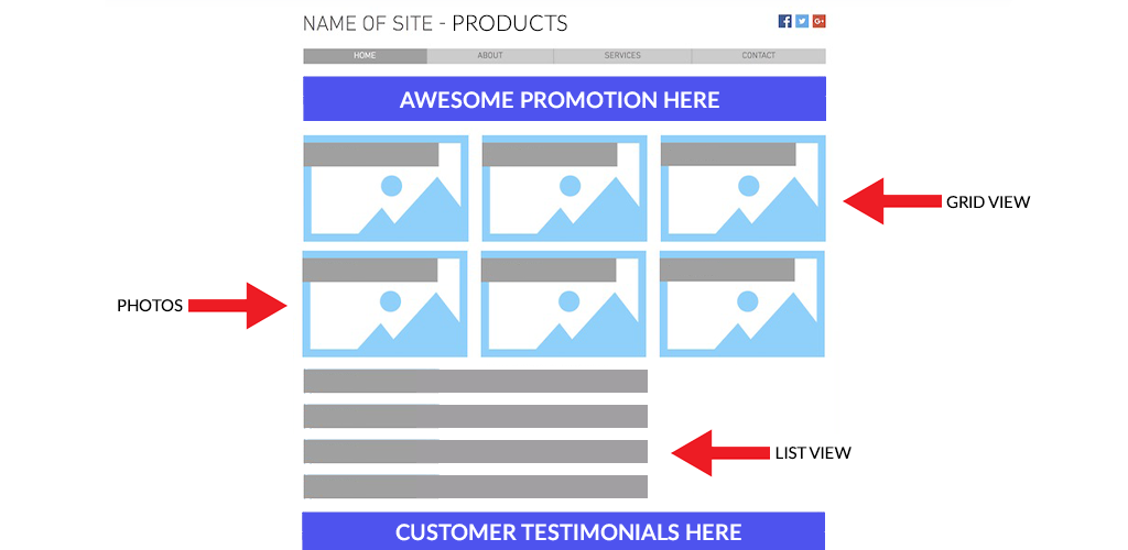
- Grid or List: The first thing to decide on a page that lists your products is how to display that list. Most ecommerce websites allow you to choose between grid view or list view. Go with whichever option you’re more comfortable with.
- Visual Promotion: A great way to boost sales is to offer fun promotions on your website. Use a dynamic, easy-to-read visual to let customers know when you have a special running; this might encourage them to buy more than they intended. You can also share your promotions on your home page.
- Product Details: When buying a product online versus in-person, customers have the disadvantage of not being able to touch or see the item before they buy it. Descriptions of the product are most important here so your customers have the little details and can buy from you with confidence. Your product description will also help your SEO (rankings in a search engine) to bring you from ecommerce website development to ecommerce website success.
- Photos or GIFs: Because customers usually can’t see an online product before they buy it, show them what it looks like with high quality images from a variety of angles. In some cases, especially if your product has different variations, you can also use GIFs that show those variations in a photo reel.
- Testimonials: One more crucial item to use on your product pages is testimonials. A certain level of trust has to be established between you and your customers before they will buy your products. Testimonials from other customers can help build that trust, especially if you build a happy relationship with them. Testimonials are also a great way to learn of flaws with your products so you can keep perfecting them as you need to.
Checkout Page
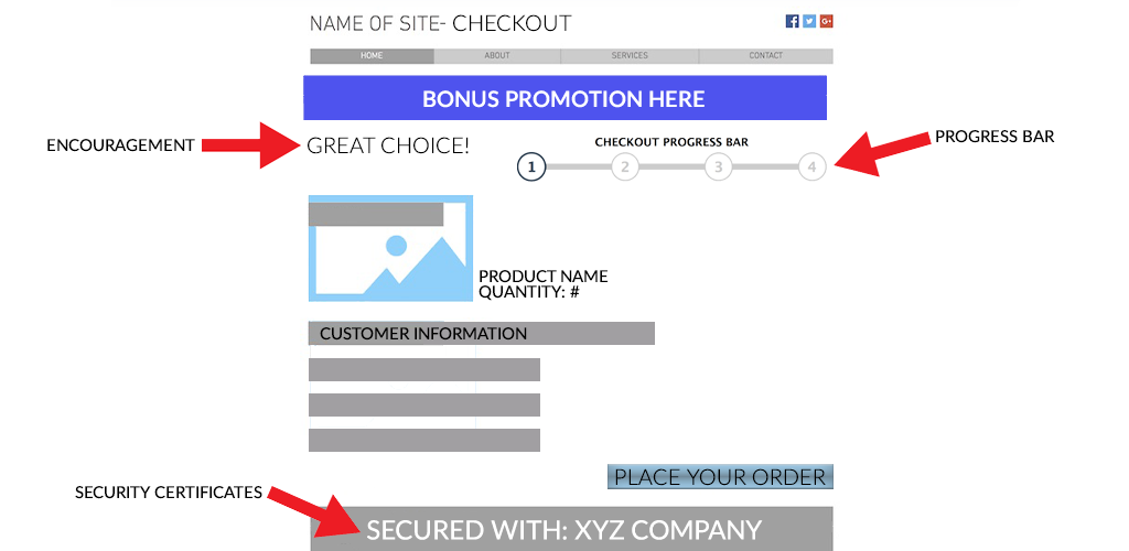
- Encouragement: When customers click to your checkout page, often they are still debating whether or not buy the product in their cart. Encourage them with phrases like “great choice” or “we’re excited for you to try this product!” It gives them a confident nudge to finish the checkout process. In some cases, adding an encouraging “bonus” promotion to the checkout that they didn’t expect (for example, free shipping) is another excellent way to convince them to make their purchase.
- Security Certificates: To bring trust back into the picture, there is a certain level of risk in sharing credit card information with an ecommerce company, especially for first-time buyers. Reassure your customers that your checkout process is safe with security certificates and badges.
- Progress Bar: If a checkout takes too long and is confusing, you risk losing the sale altogether. Add a checkout progress bar to display how far along the customer is in the process. This is especially useful if your checkout takes place across multiple pages rather than on a single one.
Contact Page
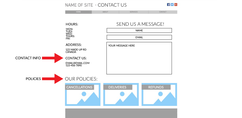
- Policies: Before customers buy from you, many want to know your policies on order cancellations, deliveries, and refunds. The easier to find and more comprehensive your policies are, the more likely a customer is to trust you enough to buy from you. A link to your policies is also great to add to the footer of each of your pages.
- Contact Information: In the event that customers need to get a hold of you, you want to minimize possible frustration by making it easy for them to find your contact information. The information should include a business phone number if you have one, an email address, any information about live chat that you might have, and all of your social media.
Optional Pages for eCommerce Website Development
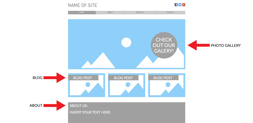
- Blogs, Galleries and About Pages, Oh My: We’ve listed the basics above but you can easily take your ecommerce website to the next level by adding extra pages to provide valuable content for your customers. Creating a blog will help improve your SEO and offer your audience posts to share on social media. Photo galleries are great visuals to convey information about a brand in a stunning and unique way. And about pages are a great way to tell your customers about your brand’s personality to connect with them better.
Shopivo’s website builder gives you access to all the features mentioned above. We help make ecommerce website development easy!
Visit Shopivo and stay tuned for exciting news and updates! Sign up for our emails and stay up-to-date on new developments and features.
