8 Dos and Don’ts of Logo Design

Close your eyes and picture the logo for Apple. Now Nike. Now McDonald’s. Chances are, you’re able to conjure up the image of the once-bitten apple, the simple swoosh, and the golden arches with perfect clarity. That’s a testament to the success of those logos; each brand is immediately recognizable from a single, simple picture. That recognition is the holy grail of most business owners. You want people to know who you are at a single glance. But how does a small business create a logo that will be known around the globe? It’s going to take hard work and time, but these dos and don’ts of logo design will help you get off to the right start.
Do:
- Research your audience
- Start with a sketch
- Create a black and white image first
- Keep it simple
- Adapt a typeface
- Create variations
- Get feedback
- Hire a graphic designer
Don’t:
- Follow trends
- Be too literal
- Go font crazy
- Write too many words
- Use too many colours
- Design with clip art
- Use drop shadows
- Redo it every year
Do: Research Your Audience
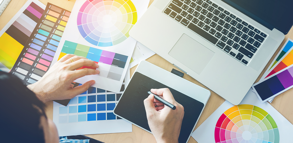
Before you even begin thinking about a potential design, you need to invest some time into researching your audience. Different logos will appeal more to different genders and ages. For example, if your business caters to an elderly clientele, something simple and big is likely to work better than a complex logo with lots of tiny details. Different colours affect different psychologies as well, and can change how customers feel about your logo and brand as a whole. The better you understand who your audience is, the more you can tailor your logo to them.
Do: Start With a Sketch
Logo design isn’t a five-minute process. You may spend weeks or even months designing, redesigning, tweaking, and then starting all over again. Before you begin to create a digital design, take some time to do paper sketches of a few different logos. This gives you freedom to play and scrap a design without feeling like you’ve sunk too much time into it.
Do: Create a Black and White Image First

Many logos look great with colour, but when converted to black and white lose some pizzazz. It’s important to know your logo will look good in both colour styles when you design it. This is especially important for small businesses without much capital: if you do physical printing, colour printing is often more expensive than black and white but if your logo looks good no matter what, you can choose the printing option that works best for you.
Do: Keep Your Logo Design Simple
When it comes to design, simple is best. Often, logos are very small, and may be used in the corner of graphics or videos. If your logo is complex and involves lots of little details, using it on a small-scale can actually make it an unrecognizable blur. By keeping it simple, you increase its effectiveness in all mediums.
Do: Adapt a Typeface
If you use text in your logo, there are thousands of fonts you can choose from. However, by using a font as-is, you run the risk of another company using the same one. Admittedly, most consumers would never notice but you may still lose some uniqueness in your design. To avoid this, you can take a regular typeface and adapt it to your brand’s personality.
Do: Create Variations

When you create your logo design, also come up with a few slight variations that can be used in different situations. You may want one with a transparent background, you may want one with a coloured background. You may like a couple of colour variations to go along with special events and promotions. Create a few different-sized images as well. This will help you prepare for every conceivable graphic design situation that you may come across.
Do: Get Feedback
Before you reveal your logo publicly, get feedback from as many people as you can. It can be from friends and loved ones, coworkers, and even your bank teller. By having other people take a look at your design, they can offer perspectives you might not have thought of. For example, maybe the font is hard to read. Maybe the colours don’t work well together. Maybe the design is too similar to another brand or looks unintentionally inappropriate. The more minds are set towards examining your logo design, the better the chance you’ll discover and fix any flaws before the logo goes public.
Do: Hire a Graphic Designer
Not everyone is a designer, nor should everyone be one. If your artistic chops don’t quite meet the task of creating a logo, don’t try to force yourself to take on that role. In the long run, hiring a graphic designer to do the job right will result in you saving time and having something that looks amazing. It’s well worth the cost.
Don’t: Follow Trends

Trends affect everything, from what we wear to what we eat and where we travel. They also have a habit of affecting logo design for new companies emerging during that trend. Our recommendation is to NOT follow the trends. If you do, you run the risk of your logo looking generic when compared to your competitors, and not properly reflecting your brand’s personality. It may also become outdated much quicker than a design that doesn’t follow any sort of trend. Designing something unique from the get-go will ultimately serve your business much better.
Don’t: Be Too Literal
Just because you run a book store doesn’t mean your logo needs to include a book. Just because you work for a bakery doesn’t mean your logo needs to include a cupcake. It’s a common logo trope that, in general, will make you blend into the competition rather than stand out. Instead, use your more literal ideas as jumping-off points for more abstract but unique designs that reflect your brand without screaming about it at your customers.
Don’t: Go Font Crazy
Not every logo uses text. But, if yours does incorporate text of some sort, carefully choose your font and don’t use more than two different ones. If you can keep your text to a single font, that’s even better. Blending too many different typefaces contributes to logo clutter and will make your identifying image less memorable (or even downright unpleasant to look at). It will also cause the image to lack cohesion.
Don’t: Write Too Many Words

Another caution when it comes to using text in your logo: too many words is just as much of a problem as too many fonts. The best logos are the simplest ones, and text adds complications. By trying to cram in your address, or your email, or your website, you likely have to shrink the text which also may make it indecipherable to your audience. If you must use words, stick to the name of your business and stop there.
Don’t: Use Too Many Colours
Just as you shouldn’t use too many fonts, you also shouldn’t use too many colours in your logo design. Colour helps make an image pop when used well, but when overused it can make an image look muddy, cluttered, and poorly designed.
Don’t: Design With Clip Art
Clip art is great to use as a placeholder in your design. It can show you what an end result might look like before you spend hours on it, only to realize you hate the finished product. However, you should avoid keeping pieces of clip art permanently in your final result. They’re typically considered “public” art which means any other business can use them too. Being forced to share elements of design with another business reduces the uniqueness that once belonged just to you.
Don’t: Use Drop Shadows

Drop shadows have long been used to make images “fancy.” In some cases, they genuinely can help an image stand out, especially if the image is competing with a strong background. However, leave the drop shadow off of your basic logo design. Because it adds a smear of grey behind the design, it actually muddies what was once clean and crisp. If you come across a particular project that requires drop shadow, you can always add it quickly in Photoshop.
Don’t: Redo It Every Year
Some entrepreneurs think that remaining “fresh” in an ever-changing market means completely redesigning their business, including the logo, once a year. This usually isn’t true. By changing the look and feel of your business every year, you reduce how recognizable you can ever become. Your customers will be seeking out the logo they know and by changing it, you prevent them from recognizing you again. You also effectively hide yourself from new customers who once knew the old logo but maybe not your name, and now can’t find you. Take the time to find a logo you love, and stick with it.
Finally, the biggest DO of designing a logo is to have fun with it. It’s one of the most creative processes associated with launching a business, and it should be enjoyed. These guidelines can help you create something amazing. We look forward to seeing what you come up with.
Visit Shopivo and stay tuned for exciting news and updates! Sign up for our emails and stay up-to-date on new developments and features.
